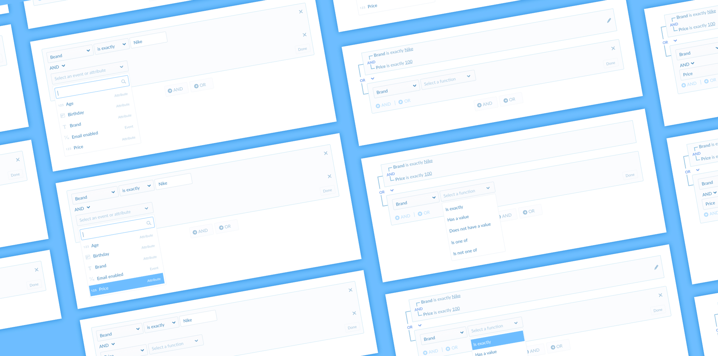
Feature Redesign: Segment Filter Editor
Context
When a marketer create a campaign, they need to define a group of people to send out the message. This group of people can be defined by demographic, behavior on the products, user attributes, or a mix of different criteria.
My goal in this project is to rethink about the workflow and the interaction of segment filter editor in campaign creation workflow.
Problem
In our current design, if a user creates more than two criteria, we only support AND logic, which means we select a group of people who fulfill both criteria A and B. If a user wants to use OR or more complex logic, they need to go to filter editor to write the logic directly. However, most of the marketers don't know how to write SQL script.
Without the flexibility to create a complex segment, it’s hard for marketers to target the right group of people. As a result, the campaign cannot speak to the right people and turn out to low engagement rate and eventually lost their customers.
Current workflow
I work with Customer Success team to collect customer feedbacks. Below are the issues in our current segment filter editor.
- Confusing Navigation: User is not clear about what each section mean.(event, function, operation and value mean).
- Inconsistent Interaction: We display the value of what user chooses or types in each section. In some of the steps, they can reselect or change the value, but some of them cannot. The rule is inconsistent and struggled to the user.
- Wrong usage of colors: The intention of using different colors is to add a visual hightlight to distinguish each section. However, the colors is not following the design principle, especially red and yellow. When a user saw red or yellow, they feel they make something wrong.
- Lacking clarity of icon: The main function of the Libra icon is to create a segment with dynamic paramenters. It’s a powerful and important feature for marketers to select a dynamic group of people without creating multiple campaigns. But most of the users don't know what is it, even don't notice there was an icon.
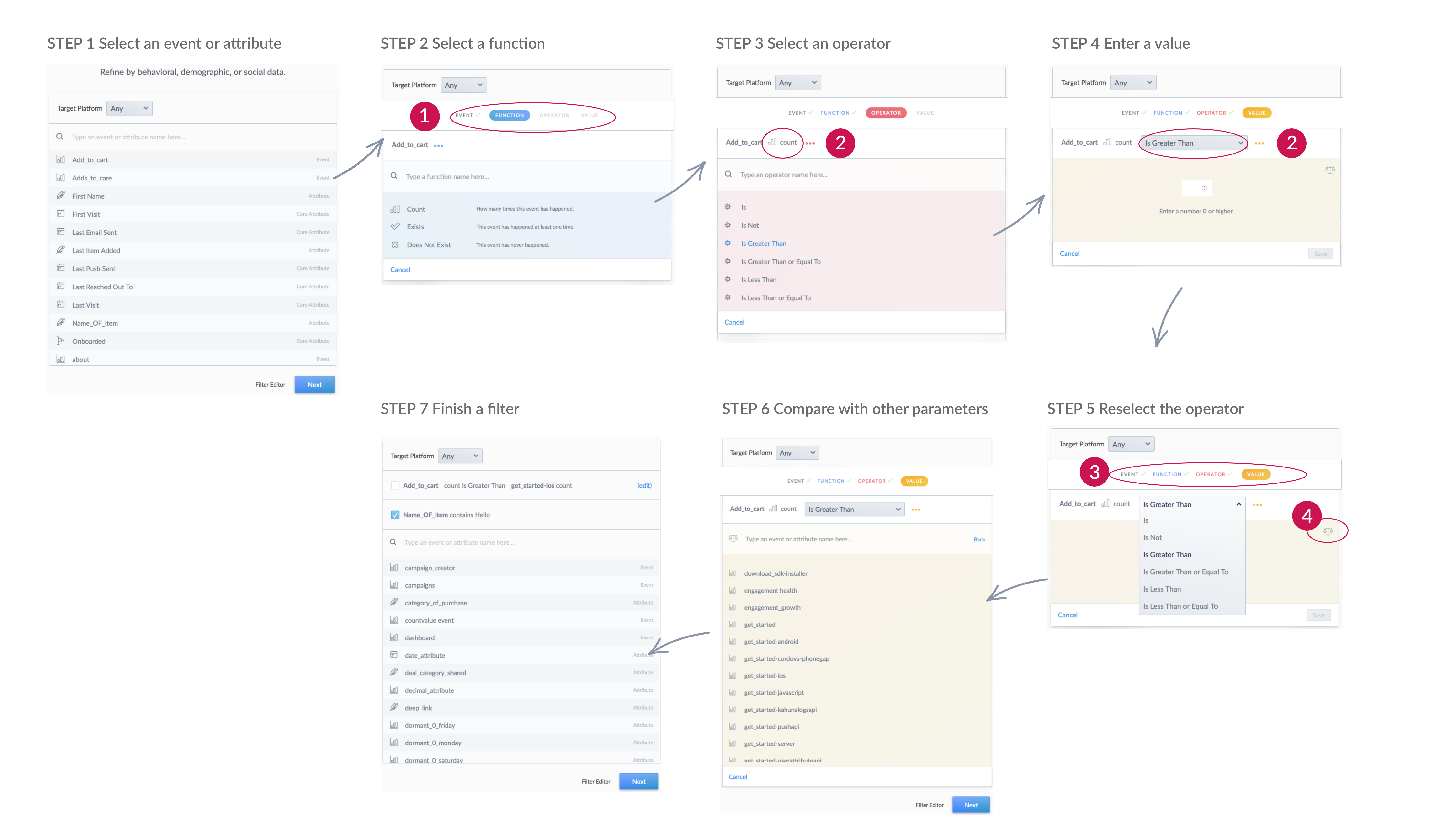
Current Filter Workflow
Research
Learning from the competitors
In order to understand what's the current filter editor's interaction in the industry, I did the reasearch to analyze the pros and cons of our competitors’ filter editor.
Appboy

Appboy segment
- Pros:
- Intuitive UI and clear structure.
- Can drag and drop to reorder the block.
- Estimate the number of the users in the segment.
- Cons:
- It supports AND and OR logic, but it can only use OR inside of a block and use AND outside of the block. Therefore, they cannot support the logic like (A and B) or (C and D)
Leanplum

Leanplum segment
- Pros:
- It allows to add multiple values in one criteria.
- When creating the criteria, it automatically form it as a sentence.
- Cons:
- It only supports AND logic when create more than two different criteria.
Observation
(A and B) or (C and D) ≠
A and (B or C) and D?
When you have both AND and OR logic in one filter, what is the right way to group it? Based on how you group them, the result will be different!
The interesting thing we find out is that there is a very common use case that can not be solved from most of the platforms.
One of the example is (Favorite Brand is Nike and Price is lower than 50) or (Favorite Brand is Adidas and Price is lower than 60).
After disucss with Product Managers, we decide to open the flexibility into the design, which means we want to allow users to create AND/OR logic anywhere.
Design Process
Ideation
After researching and understanding the problem, I provide two different ideas and quickly create prototypes to get feedback from project managers and internal marketers.
As a result, the #1 solution got more positive feedbacks. The reasons was:
- #1 solution is more intuitive. From the testing, users know a block means a group. It is easy to know you can add AND/OR logic for inside/outside of group.
- #2 solution is too complicated. There are too many options at beginning. Users get stuck and don't know how to start.
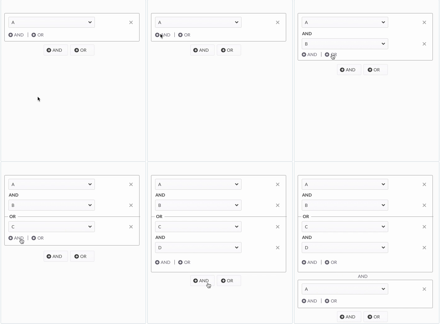
Solution 1
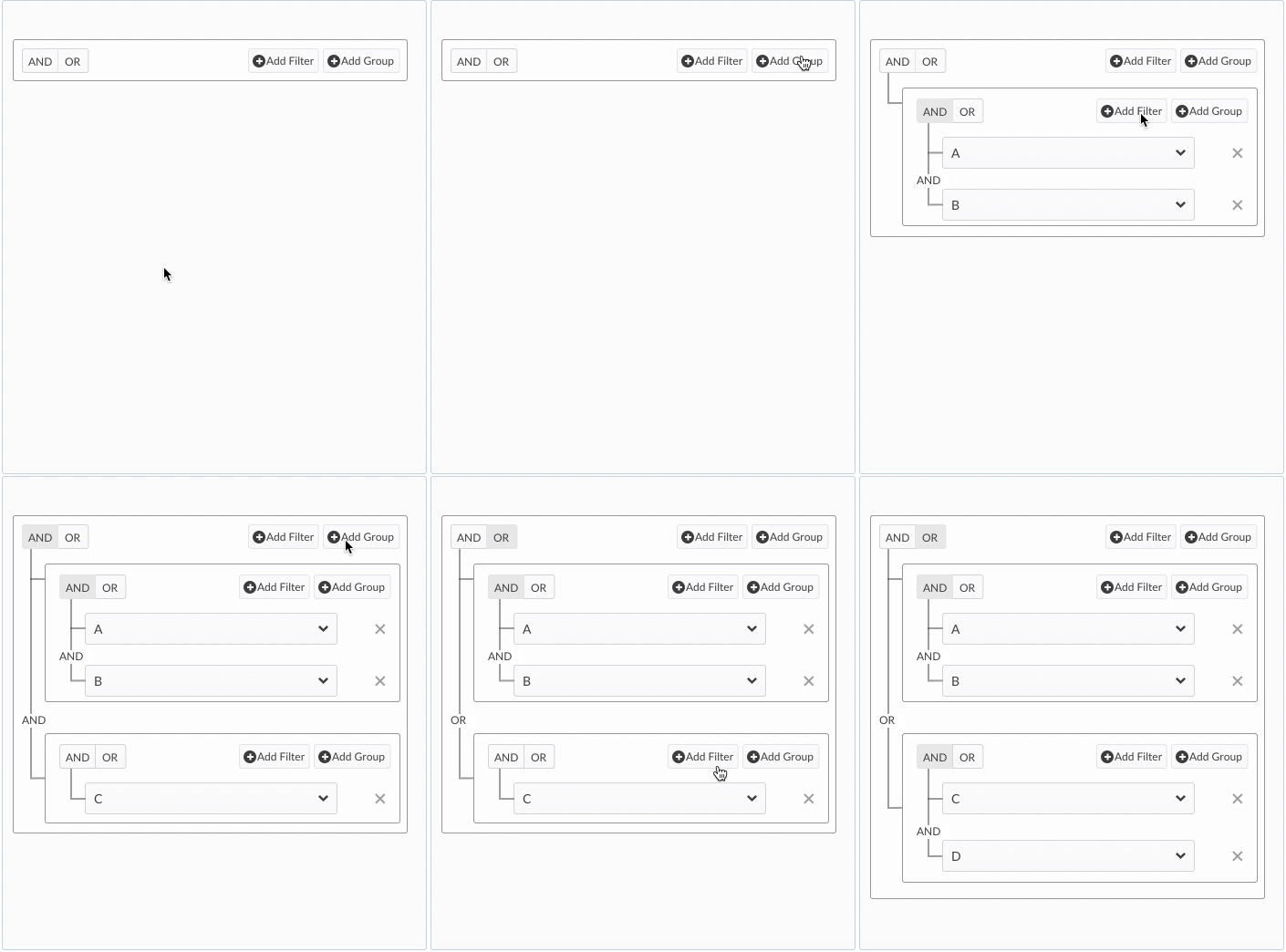
Solution 2
Iteration
After I get some ideas about our direction, the next coming up question is what if the segment filter editor get super complex? Is it still easy to understand?
When we have multiple layers, it become really hard to read. In addition, in the below example, the horizontal line that seperate the first two and thrid criteria is hard to see.
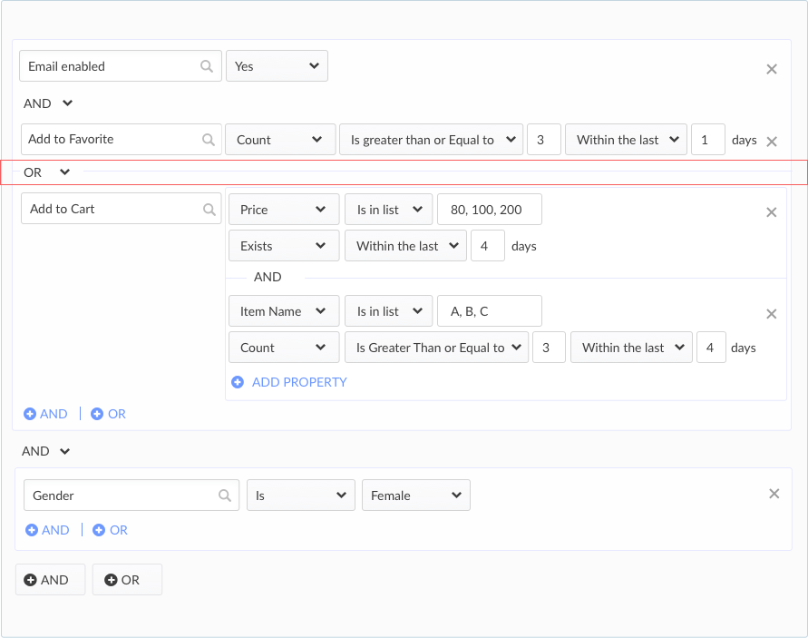
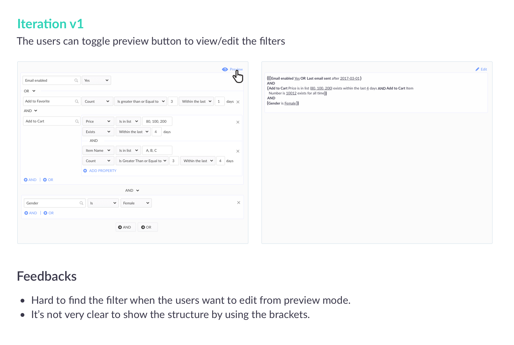
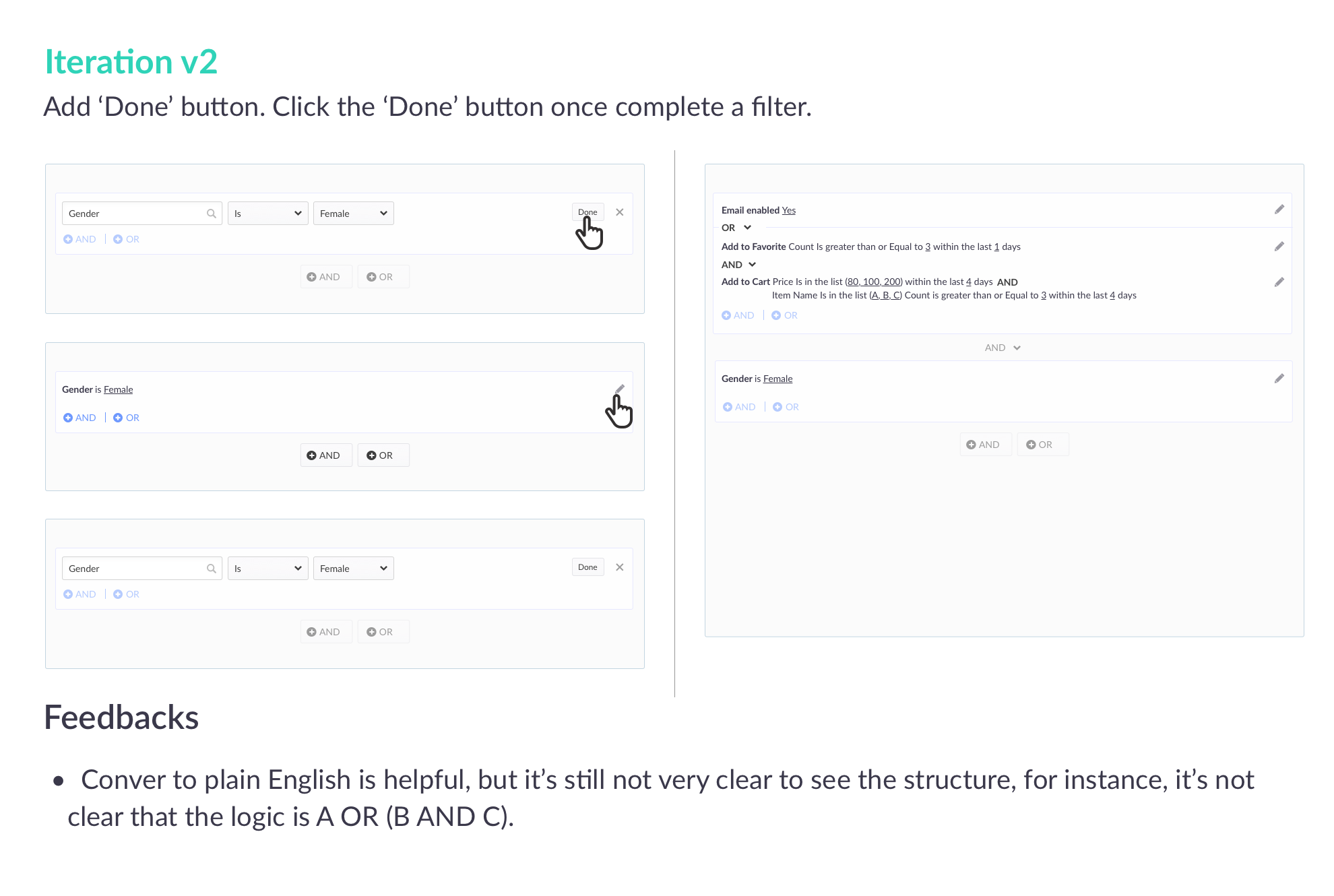
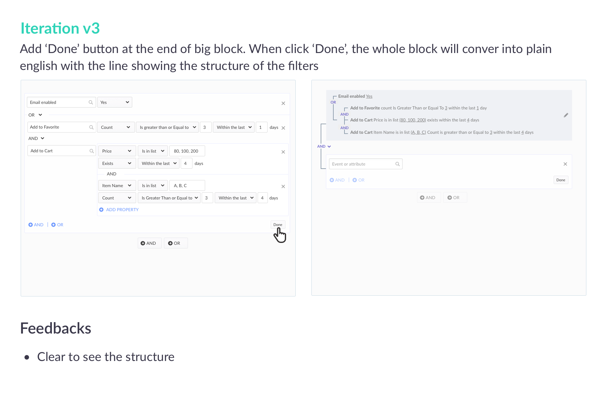
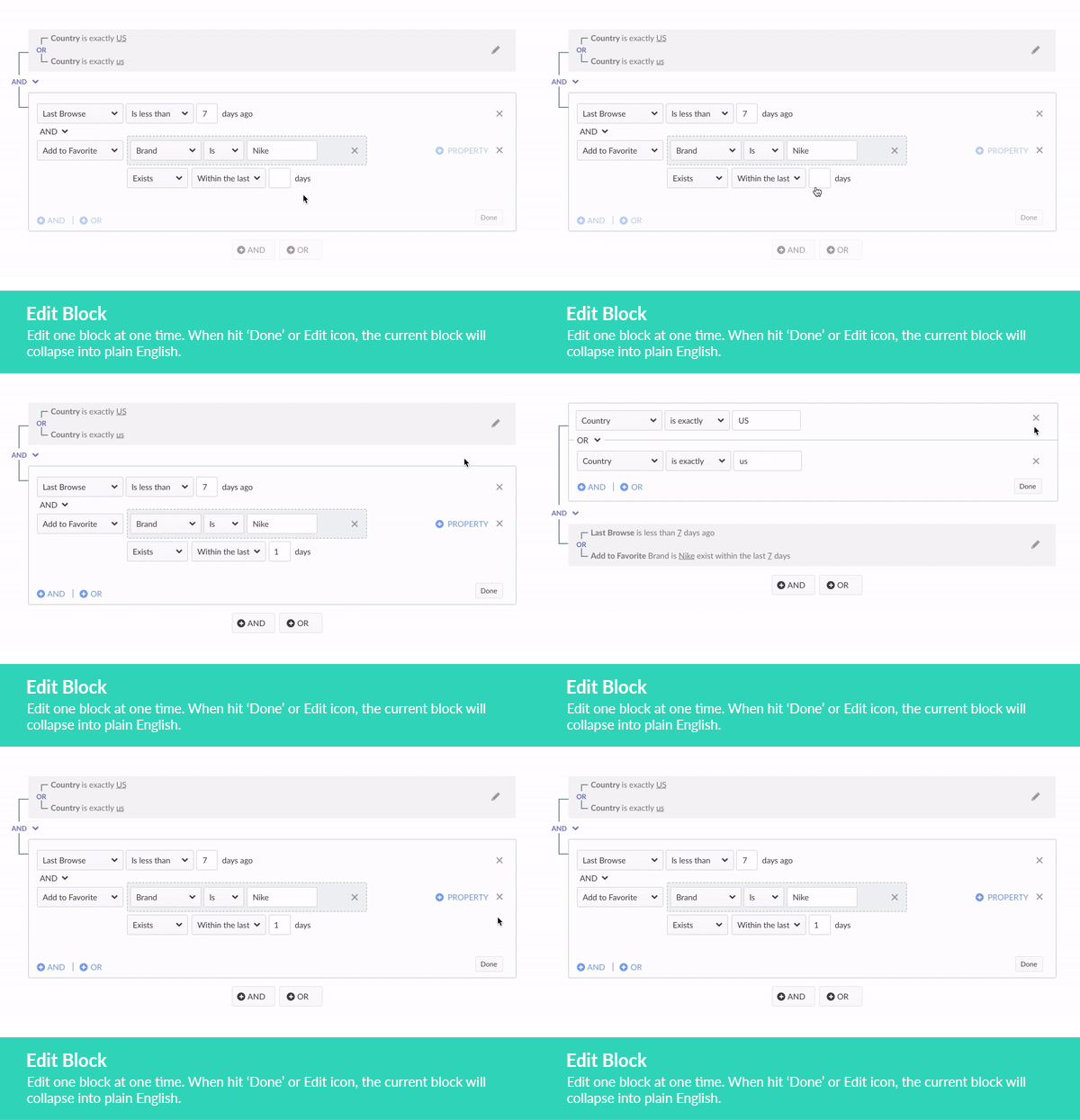
To fixed this, I work with project manager did several rounds of tests and iterations. The final solution was that we added a done button inside of the block. So, when the users completed a set of filters and hit done, then we collapsed it as plain english and used lines to draw the relationship between each criteria.
Interaction
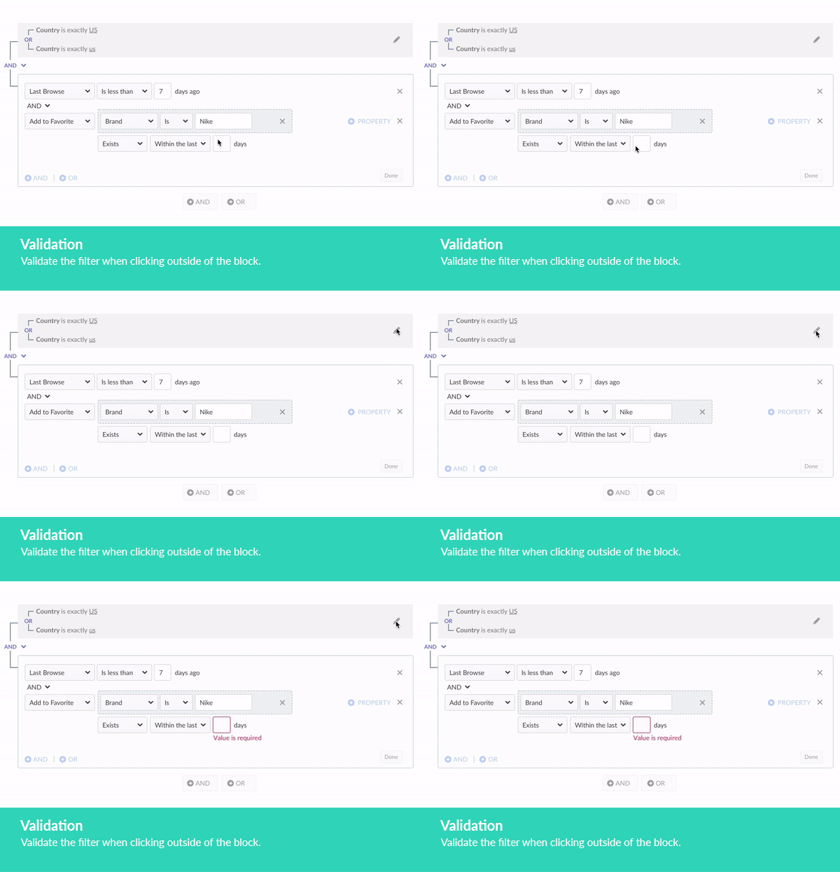
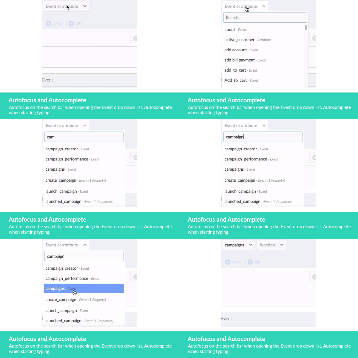
The following images illustrate some of the micro interactions of the design that we found most impactful for the user.
Final Deisgn
Through the quick tests and validations, we finally came to our final design. From implementation side, I paired with a front-end engineer to provide the interaction guidance and support.
High-Fidelity Prototype